
People first.
A welcoming stage, a shared song, and room for every kind of voice.
The Proper Volume / Brand guide
The colors, type, and details behind The Proper Volume. A practical reference for the studio, the stage, and everything we share.
Version 2.1.5 · November 7, 2026
Use the day/night control above to view the guide in either theme.
 Made for the music.
01 / The feeling
Make every person at the microphone feel like a headliner.
A welcoming stage, a shared song, and room for every kind of voice.
Clear sound, carefully timed lyrics, and visuals that support the singer.
Color, light, and a sense of occasion. Let the people remain the focus.
02 / The palette
These are the five original brand colors. The website adds navy, paper, and deeper accent variations so the same identity works at night and in daylight. Match the hex values for digital work; printed color depends on paper, ink, and the printer profile.
Flexible lead
Lead with blue or use it for signature graphics, highlights, and actions on dark backgrounds.
Flexible lead
Lead with purple or use it in logo blocks, graphic fields, and backgrounds with white type.
Flexible lead
Lead with hot pink for an artist or project, or use it for emphasis and lively accents.
A softer neutral
Brand artwork, warm backgrounds, and a comfortable alternative to white.
Clean contrast
Logo lettering, clear space, and type on strong purple backgrounds.
The hex values above are the digital reference, including when an older printed swatch looks different.
03 / Day & night
Night brings the stage atmosphere. Day makes room for paper and daylight. The values below are generated from the SCSS foundation shared by the website and this guide.
Night
Clear type, comfortable surfaces, and an accent with purpose.
Day
Clear type, comfortable surfaces, and an accent with purpose.
| Role | Night | Day |
|---|---|---|
Page background--bg | ||
Panel background--panel | ||
Primary text--cream | ||
Supporting text--muted | ||
Blue text and actions--blue | ||
Purple accent--purple | ||
Pink accent--pink | ||
Decorative blue--brand-blue | ||
Decorative purple--brand-purple |
For normal text, use a contrast ratio of at least 4.5:1. Large text needs at least 3:1. Check the actual foreground and background together; a brand color is not automatically a readable text color.
Night text#F4F2E9 / #090E1817.22:1
Night blue#0EB7FF / #090E188.49:1
Day blue#1765A6 / #FDFEF86.01:1
White on purple#FFFFFF / #601CE97.39:1
These sample pairs meet the normal-text threshold. Use blue for small text on navy; keep the signature purple for graphic fields with white type. WCAG contrast guidance
04 / Typography
The website and downloadable guide use Nunito Sans. These samples use the site's own font, heading styles, and body copy.
Nunito Sans / Headings 800 / Extra bold
Aa Bb Cc Dd Ee Ff Gg Hh Ii Jj Kk Ll Mm
0123456789 & ! ?
Professional sound, thoughtful visuals, and a welcoming stage. The details should help people feel at home in the music.
Avenir Next and Novecento Sans Wide Bold belong to the original identity. Existing artwork can keep them; new website copy uses Nunito Sans. Use the supplied artwork for the logo rather than rebuilding it with typed text.
05 / Pattern library
This inventory is extracted from the SCSS modules that build the website. Each entry carries its source path and component notes; the examples below use the site's real rendering helpers and classes.
Atom / Buttons
.button · .button--secondaryMolecule / Form field
A local component example; nothing is submitted.
.field · .field-hint · .field-errorMolecule / Content card
A welcoming stage and an experience shaped around your guests.
.simple-card52 documented modules
Colors, themes, type tokens, fonts, and shared accessibility rules.
Styles for accessibility, compiled in the existing cascade order.
scss/00-foundations/_accessibility.scsshtml:not(.js) .js-onlyinput:focus-visible,textarea:focus-visible,select:focus-visible::selection[hidden].skip-link.skip-link:focus
Styles for css variables, compiled in the existing cascade order.
scss/00-foundations/_css-variables.scss:root[data-motion=running][data-page-visible=true] .landing-spotlights[data-visible=true]::before,:root[data-motion=running][data-page-visible=true] .landing-spotlights[data-visible=true]::after:root:root[data-motion=running][data-page-visible=true] .fog-layer:root[data-motion=running][data-page-visible=true] .fog-layer:nth-child(2):root[data-motion=running][data-page-visible=true] .fog-layer:nth-child(3):root[data-motion=running][data-page-visible=true] .intro-atmosphere[data-visible=true] .fog-layer
Styles for elements, compiled in the existing cascade order.
scss/00-foundations/_elements.scssbody*,*:before,*:afterimg,svgimg
Styles for fonts, compiled in the existing cascade order.
scss/00-foundations/_fonts.scssStyles for theme surfaces, compiled in the existing cascade order.
scss/00-foundations/_theme-surfaces.scss.header-bar.header-request[data-theme=day] body[data-theme=day] ::selection[data-theme=day] .section--tinted[data-theme=day] :is(.site-header,.logo-intro)
Original brand colors, theme palettes, typography, and documentation data share this source.
scss/00-foundations/_tokens.scssThe smallest reusable interface pieces: type, links, buttons, icons, and controls.
Primary, secondary, and text actions use the shared interface tokens.
scss/01-atoms/_buttons.scssbody,dialog,input,textarea,button,selecta,button,input,textarea,selecta,buttonbutton,input,textarea,selectbuttonbutton:disabled
Styles for copy code, compiled in the existing cascade order.
scss/01-atoms/_copy-code.scss.brand-copy.brand-copy code.brand-copy .icon.brand-copy:disabled.site-header,.site-footer,.brand-index,.brand-copy .icon,.brand-intro .actions,.brand-application-copy .actions,#song-request-dialog,.admin-shortcuts
Consistent stroke, scale, and accessible decorative treatment.
scss/01-atoms/_icons.scss.icon
Readable inline links, quiet links, and accent text.
scss/01-atoms/_links.scssa.text-blue.quiet-linka[href^="#"]
A keyboard-accessible day/night control shared by public pages.
scss/01-atoms/_theme-control.scss.menu-tools .theme-preference.menu-tools .theme-preference>[data-theme-status].theme-toggle.theme-toggle-icon.theme-toggle-icon>.icon,.theme-toggle-icon>svg.theme-toggle-icon>:last-child
Headings, body text, and small labels share the foundation type scale.
scss/01-atoms/_typography.scssh1,h2,h3,ph1,h2,h3h1h2h3p
Styles for waveform, compiled in the existing cascade order.
scss/01-atoms/_waveform.scss.sound-art.sound-art svg.sound-art ellipse.sound-art ellipse+ellipse.sound-art circle.sound-wave
Small groups with a clear purpose, such as a field, navigation group, or card.
Styles for admin shortcuts, compiled in the existing cascade order.
scss/02-molecules/_admin-shortcuts.scssbody[data-page^="library-"] .admin-shortcut.admin-shortcut.admin-shortcut .icon[data-theme=night] .admin-shortcut
Small content groups combine type, supporting copy, and an action.
scss/02-molecules/_cards.scss.detail-row.detail-row>span.detail-row .icon.simple-card>.icon,.resource-card>.icon:first-child.simple-card h3,.resource-card h3.resource-card
A core color, its role, and a copyable value are documented together.
scss/02-molecules/_color-swatch.scss.brand-swatches.brand-swatch.brand-swatch-color.brand-color-0eb7ff.brand-color-601ce9.brand-color-ff007f
Styles for feature card, compiled in the existing cascade order.
scss/02-molecules/_feature-card.scss.feature-card.card-art.art-icon.card-copy.card-copy>.eyebrow.card-copy h3
A label, input, hint, and error message form one reusable field.
scss/02-molecules/_form-field.scss.services-dropdown fieldset.services-dropdown .checkbox-field:last-of-type.site-form.form-required.form-grid.field
Expandable navigation, social links, and usable touch targets.
scss/02-molecules/_navigation.scss.menu-content.menu-tools.nav-socials.menu-tools [data-theme-system].noscript-nav.menu-toggle
Styles for pagination, compiled in the existing cascade order.
scss/02-molecules/_pagination.scss.library-pagination.library-pagination a.library-pagination a[aria-current]
An eyebrow, headline, and introduction establish a section.
scss/02-molecules/_section-heading.scss.page-heading.section-heading.section-heading h2.section-heading p.page-heading>.eyebrow.page-heading h1
Larger compositions, including the header, footer, catalogs, and atmosphere blocks.
Styles for article editor, compiled in the existing cascade order.
scss/03-organisms/_article-editor.scss.admin-article-editor.admin-article-editor > label.admin-article-editor > p.admin-article-editor textarea[hidden].article-editor-toolbar.tpv-admin .article-editor-toolbar select
Styles for brand marks, compiled in the existing cascade order.
scss/03-organisms/_brand-marks.scss.brand-logo-grid.brand-logo-card.brand-logo-stage.brand-logo-stage--night.brand-logo-stage--day.brand-logo-stage>img
Styles for brand photography, compiled in the existing cascade order.
scss/03-organisms/_brand-photography.scss.brand-photo-grid.brand-photo-grid figure.brand-photo-grid img.brand-photo-grid figure:last-child img.brand-photo-grid figcaption
Styles for brand voice, compiled in the existing cascade order.
scss/03-organisms/_brand-voice.scss.brand-voice-grid.brand-voice-card.brand-voice-card h3.brand-voice-card>p:last-child
Exclusive, linkable disclosures with a reduced-motion path.
scss/03-organisms/_faq.scssa:focus-visible,button:focus-visible,summary:focus-visible.faq-layout.faq-item.faq-item:first-childsummarysummary::-webkit-details-marker
Search, catalog rows, source information, and pagination.
scss/03-organisms/_library.scss.library-top.library-top h2.library-top p.library-search.library-search-label.library-search svg
Styles for media gallery, compiled in the existing cascade order.
scss/03-organisms/_media-gallery.scss.media-grid.media-card.media-photo-link.media-photo-link img.media-enlarge.media-enlarge .icon
Styles for media viewer, compiled in the existing cascade order.
scss/03-organisms/_media-viewer.scss.media-dialog.media-dialog::backdrop.media-dialog[open].media-dialog[open]::backdrop.media-dialog figure.media-dialog img
Component examples, searchable source documentation, and the generated atomic inventory.
scss/03-organisms/_pattern-library.scssView in context Styles for request dialog, compiled in the existing cascade order.
scss/03-organisms/_request-dialog.scss.media-dialog[open] .media-dialog-inner.media-dialog-inner.media-dialog-close.request-dialog.request-dialog::backdrop.dialog-inner
Styles for request form, compiled in the existing cascade order.
scss/03-organisms/_request-form.scss.request-flow.request-confirmation.request-confirmation-icon.request-confirmation-icon>.icon.request-confirmation h1,.request-confirmation h2.request-confirmation>[data-request-success-message]
A shared site map and brand sign-off.
scss/03-organisms/_site-footer.scss.site-footer.footer-grid.footer-brand img.footer-brand p.site-footer nav>.eyebrow.site-footer nav>a
Brand, current page, request action, theme control, and navigation.
scss/03-organisms/_site-header.scss.site-header.js .site-header[data-intro=true][data-past-intro=false][data-open=false].header-bar.wordmark.wordmark strong.js .site-header[data-intro=true][data-past-intro=false][data-open=false] .wordmark
Styles for theme palette, compiled in the existing cascade order.
scss/03-organisms/_theme-palette.scss.brand-theme-previews.brand-theme-preview.brand-theme-preview h3.brand-theme-preview>p.brand-theme-preview .brand-kicker.brand-theme-sample
Styles for type specimen, compiled in the existing cascade order.
scss/03-organisms/_type-specimen.scss.brand-type-specimen.brand-type-specimen h2.brand-alphabet.brand-type-specimen>p:last-of-type.brand-type-specimen dl.brand-type-specimen dt
Decorative haze stays behind content and respects reduced motion.
scss/03-organisms/blocks/_atmosphere.scss.intro-atmosphere.intro-atmosphere:not([data-fluid=true]) .fog-layer.intro-atmosphere:not([data-fluid=true]) .fog-layer:nth-child(2).intro-atmosphere:not([data-fluid=true]) .fog-layer:first-child.intro-atmosphere~.intro-logo.intro-atmosphere~.intro-cue
Music motifs and optional parallax support the page hierarchy.
scss/03-organisms/blocks/_decorative-scene.scss.logo-intro.landing-spotlights.landing-spotlights::before,.landing-spotlights::after.landing-spotlights::before.landing-spotlights::afterfrom
The paired logo and opening action compose the home-page introduction.
scss/03-organisms/blocks/_logo-intro.scss.intro-actions.intro-actions .intro-cue.intro-motion.logo-intro.intro-light.intro-logo
Styles for statement, compiled in the existing cascade order.
scss/03-organisms/blocks/_statement.scss.statement-panel.statement-panel>div:first-child.statement-panel .eyebrow.statement-panel h2.statement-panel p:not(.eyebrow).statement-art
Styles for support, compiled in the existing cascade order.
scss/03-organisms/blocks/_support.scss.donation-panel.donation-panel h2.donation-panel .button.bitcoin-panel code.support-grid.support-grid h2
Shared containers, grids, and responsive page composition.
Page containers, grids, section spacing, and responsive composition.
scss/04-templates/_layout.scss.wrap.section.section--tight.section--tinted.feature-grid,.two-grid.three-grid
Styles for public layout, compiled in the existing cascade order.
scss/04-templates/_public-layout.scss.optional.services-dropdown legend.actions.status-dot.plain-list.plain-list li+li
Specific public and administrative layouts built from the shared parts.
Styles for admin, compiled in the existing cascade order.
scss/05-pages/_admin.scss*htmlbody.tpv-admin.tpv-admin a.tpv-admin button, .tpv-admin input, .tpv-admin select, .tpv-admin textarea.tpv-admin :focus-visible
Readable article typography and owner-authored rich content.
scss/05-pages/_articles.scss.resource-card,.simple-card,.price-card,.article-card,.aside-card.prose.prose p+p.prose a.article-grid.article-card
The generated inventory, live components, and branding notes compose this page.
scss/05-pages/_brand-guide.scss.brand-guide[data-theme=day] .brand-guide.brand-intro.brand-version,.brand-small.brand-intro .actions.brand-intro .brand-small
Styles for contact, compiled in the existing cascade order.
scss/05-pages/_contact.scss.contact-layout.split-layout,.contact-layout.form-grid,.contact-layout
Styles for home, compiled in the existing cascade order.
scss/05-pages/_home.scss.home-hero.hero-copy.hero-copy .eyebrow.hero-copy h1.hero-copy h1::first-line.hero-copy .lead
Shared cards and layout present the current event pricing.
scss/05-pages/_pricing.scss.pricing-grid.price-card.price-card--featured.price-card>.eyebrow.price.price span
Styles for projects, compiled in the existing cascade order.
scss/05-pages/_projects.scss.project-card.project-mark.project-mark>span.project-mark>.sound-art.project-card--1 .project-mark.project-card--2 .project-mark
Search form, public results, and pagination.
scss/05-pages/_search.scss.site-search-trigger.site-search-dialog.site-search-controls input
Styles for services, compiled in the existing cascade order.
scss/05-pages/_services.scss.capability-list p.capability-list .icon.event-types.event-types ul.event-types li
SCSS modules → compiled website assets + this component inventory. The production website serves distributable CSS; component notes and design tokens are maintained with their source modules.
Interface / reference
A practical guide to the headings, actions, links, and motion used across the website. The pattern library above links each family to its source.
| Variant | Purpose and use |
|---|---|
| Page heading / H1 | One main page title, usually paired with an eyebrow and lead. It uses the largest responsive heading scale. |
| Section heading / H2 | Introduces a major section or featured message; may pair with supporting copy. |
| Card and subsection heading / H3 | Names a service, article, feature, or smaller topic within a section. |
| Article subheadings / H4–H6 | Use semantic levels for deeper article structure when needed. The shared visual scale focuses on H1–H3; lower levels inherit their context. |
| Eyebrow and lead | The eyebrow is a short context label above a heading; the lead introduces the page in larger body text. |
| Footer headings | Group links under Discover, The Studio, Plan an event, and Support. |
| Variant | Purpose and use |
|---|---|
| Primary / filled | Blue-filled .button for the most important action, including song requests and event inquiries. |
| Secondary / outline | Blue-outlined .button--secondary for supporting actions, downloads, and external destinations. |
| Text action | .button--text removes the fill and border for a lower-emphasis action. |
| Quiet action | .quiet-link pairs a low-key text link with an arrow, such as the closer-look link on the homepage. |
| Copy control | .copy-button copies useful text, such as the Bitcoin address, with a status message. |
| Icon controls | The request, theme, menu, close, social, and edit controls use recognizable icons, accessible labels, and tooltips where appropriate. |
| Form action | Submit buttons use the primary button style; disabled, error, success, and focus states communicate status. |
| Variant | Purpose and use |
|---|---|
| Inline and prose links | Links in body copy preserve the reading flow; use descriptive text and visible focus. |
| Main navigation and submenu | Menu links identify the current page; expandable groups organize related destinations. |
| Footer links | Grouped, text-based links make the major site sections easy to scan. |
| External and download links | External destinations use a directional icon and open separately; downloads use a download icon. |
| Anchor and FAQ permalinks | In-page links move to a section; FAQ permalinks address individual questions. |
| Social and resource links | Social destinations use labeled icons; resource cards combine an icon, title, description, and link. |
| Pagination and catalog links | Page links expose browseable library pages; individual file links identify their format. |
| Skip link | The keyboard-accessible skip link moves directly to the main content. |
| Variant | Purpose and use |
|---|---|
| Fog and stage lighting | Drifting fog and slow beams evoke a karaoke stage: the atmosphere frames the singer and makes the moment feel like a performance. Keep text legible and the person at the center. |
| Parallax artwork | Microphone and sound-wave motifs shift subtly with scrolling to create depth. |
| Scroll reveals and masonry | Content fades into view; photo and project cards use an adaptive masonry arrangement while retaining reading order. |
| Home intro and logo blocks | The introductory transition moves toward the main content. Logo blocks can be dragged, and horizontal gestures cycle logo colors. |
| Sticky header and menu | The header and its controls transition as the user scrolls; the expanded menu slides and fades into place. |
| Theme transition | Day and night themes switch with a brief reveal when the browser supports it. |
| Dialogs and photo viewer | The request dialog and image viewer use a brief entrance and backdrop transition. |
| Accordions | FAQ answers and navigation groups expand and collapse with motion where supported. |
| Hover, focus, and tooltips | Buttons, arrows, navigation items, media cards, and the wordmark respond to interaction; icon labels appear as tooltips. |
| Reduced motion and pause | Respect reduced-motion preferences and provide the atmosphere pause control. Content and essential actions remain available without animation. |
06 / The mark
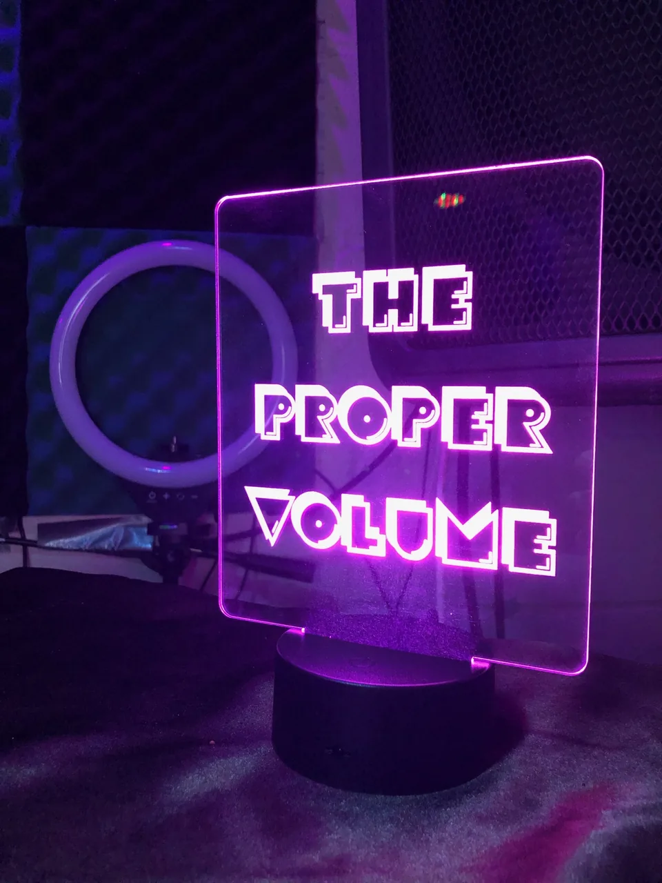
The Proper Volume adapts its primary color to the artist, event, or creative project. Blue, pink, and purple can each lead: pair a supplied logo with the color that fits the work, while preserving the original artwork and its clear space.







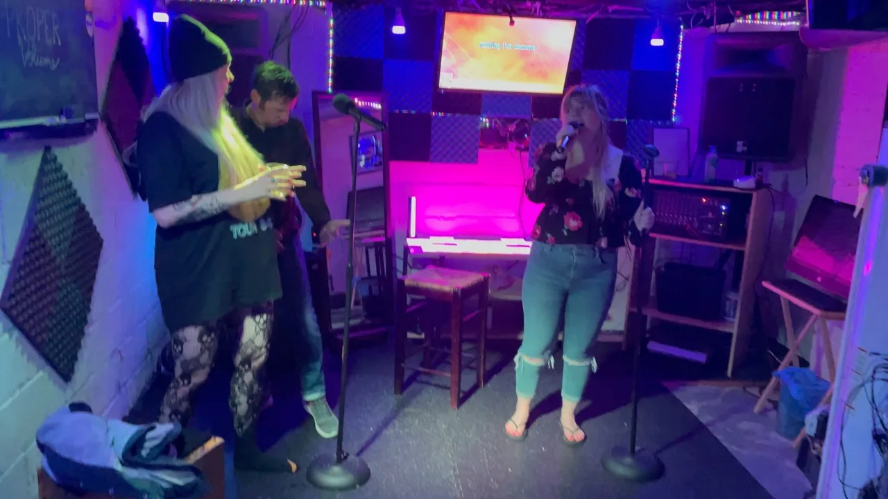
07 / Photography & atmosphere
The experience is the image. Favor real performances, shared moments, and details from the room.
08 / Our voice
Confident about the work. Welcoming to the singer. A little playful when the moment calls for it.
Warm and welcoming
Avoid: Only the best singers belong here.
Clear and useful
Avoid: Unlock a revolutionary, next-level sonic experience.
Playful, in small doses
Avoid: Shouting, forced jokes, or a paragraph full of emojis.
Write The Proper Volume in public copy; TPV is useful after the full name or where space is limited. Use sentence case for headings, the Oxford comma in lists, and short, direct calls to action. Keep social announcements to one paragraph, usually two or three sentences.
09 / In practice
A quiet frame, bold type, one clear action, and a little atmosphere. Use the same building blocks across the website and supporting materials.
The studio & the stage
Custom karaoke production.
Live entertainment. The proper volume.
Web edition 2.1.5. The PDF is a dated snapshot; this page shares the website's generated tokens and component inventory.